

While the entire fashion world was in complete awe about Louis Vuitton’s Spring Summer 2013 fashion show, I was keeping my enthusiasm for myself. Not (just) because I wanted to be the Grinch who stole the joy out of Vuitton’s fashion spirit, but mainly because I wasn’t exactly sure what was Marc Jacobs approach this season.
And I think I found it. He’s a genius at what he does: Marc. Either that, or he has entire team – what am I saying? an entire floor! an entire building! of geniuses behind him! Calling the marketing shots to sustain every fashion initiative signed by Marc Jacobs for Louis Vuitton. You’d think fashion evolution has us all estranged from our very childish core, huh? You couldn’t be more wrong! (you’re curious about what makes me say that? hit the jump and find out!)

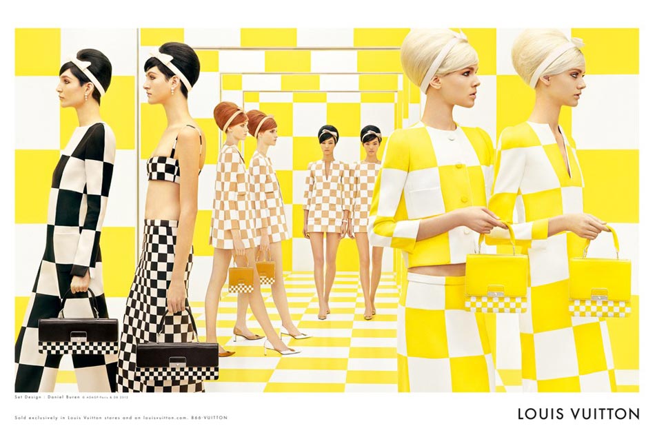
In order to sink you into the repetition situation, I want to you revisit Louis Vuitton’s latest collaboration / campaign (you can see it here). Yes. Yayoi Kusama. Dots. Simple, strong colors in combinations of two (white & red, yellow & black) disposed in familiar patterns. Now move back – visually – to the Louis Vuitton Spring Summer 2013 ad campaign. Simple, strong colors in combinations of two (yellow & white, black & white), disposed in familiar patterns. And no, this is not just copy – pasting the phrase above, it’s the very Vuitton essence distilled before our eyes!
Louis Vuitton has always been a matter of multiplication / repetition for Marc Jacobs. His visual identity established success for the LV maison is based upon the repetitive monogram motif on luxury accessories. Marc’s basic, almost childish approach of Vuitton’s fashion has proved to be certified gold. So he’s not planning on giving up to it any time soon.
He actually seems to be putting all his efforts in translating an old, Asian – specific educational philosophy into fashion: repetition. I didn’t even come up with that myself – it’s something I read in a comparative educational study a few weeks ago. I will only quote from memory what I think is relevant for this Louis Vuitton case here: while American’s education is based on ‘talent’ – thus eliminating the need to actual study / perfect through repetition because of innate abilities, the Asian education is based on work. Repetition to perfection.

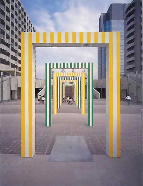
Steven Meisel photographed the new season’s ad campaign based on the actual Fashion Week show. There’s also an artsy side to this as well, much like in past campaigns: the backdrop of the show and now of the campaign itself was executed by the French conceptual artist Daniel Buren. Daniel’s most notable work is ‘Les Deux Plateaux’ (now known also as the Buren Columns) – a statuary installation of striped columns in the Palais Royal’s court.
Actually, from what I could browse, Buren’s work is a distinctively geometric art game based on vividly colored stripes. I’d like our dear friend, Ellington, who is so much better at art than I am, to help us out with more facts & significations in Buren’s work and her take on his collaboration with Louis Vuitton, see if I made any fashion sense in my lengthy piece.


")


2 comments
Very insightful post Kpriss with interesting points of view.
One thing is not clear for me yet : did you like the collection? the show ? would you wear that?
:) clever: I hadn’t cleared that out.
It’s a lovely fashion show. With a fresh, theatrical approach of fashion. But I wouldn’t wear it. I don’t feel it represents me. :)
Leave a Comment