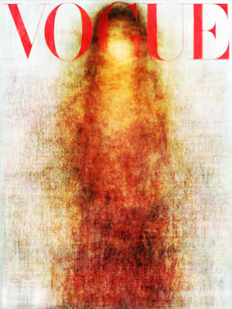
Who would’ve thought that a year long of Vogue covers (various international issues combined) could be so morally and visually challenging (yes, it’s not just you, this image bares a forced resemblance with the Virgin Mary)?
Call it a miracle, call it visual cliché, all 2010 Vogue covers seem to operate on one aesthetic and one aesthetic only. Vertical, middle page layout can be summarized in this blurry red and orange silhouette. Cliché much? (via)


1 comment so far
I like it.
it reminds me William Turner paintings.
Leave a Comment