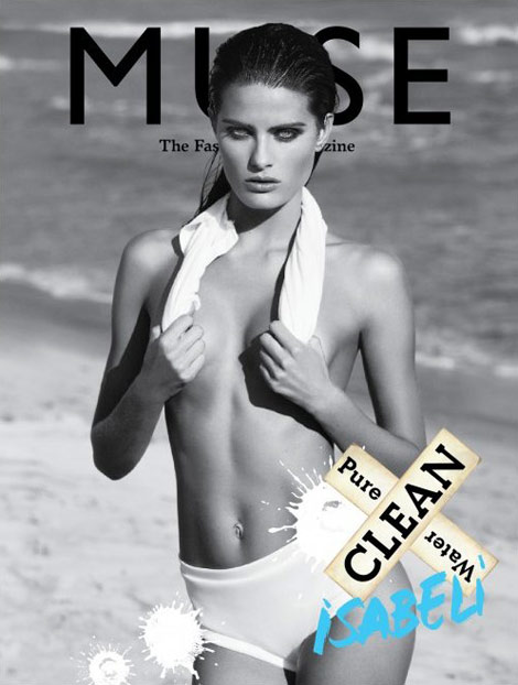
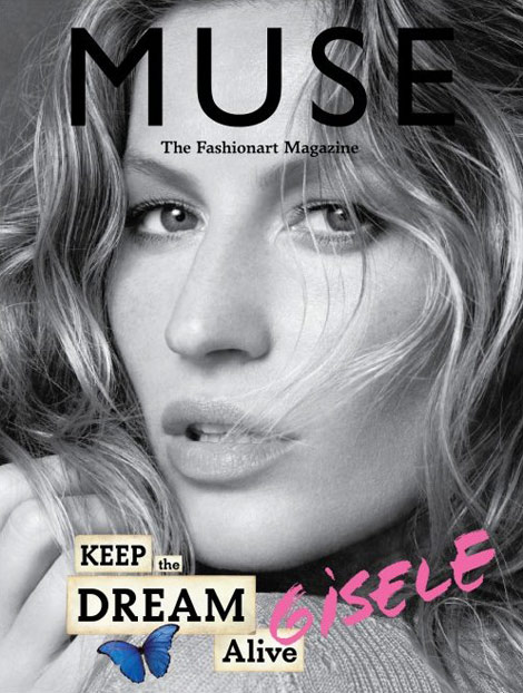
You know I like simple covers. And more – when there’s no writing on the cover, it makes it even more interesting (as opposed to the floating characters on models faces, shoulders, everywhere on mainstream magazines).
However, there’s something as “too simple” when it comes to the Muse #22 Summer 2010 covers trifecta. Gisele Bundchen, Isabeli Fontana, Angela Lindvall. Gorgeous ladies, impeccable photos. And still – am I at that point sold to the mainstream, I can no longer see or appreciate real magazines simplicity? (is it just me, or Isabeli Fontana‘s cover has something from Helena Christensen’s Wicked Games?) (photos via)










1 comment so far
Yes I think that you are right about Isabeli’s cover Kpriss. I think that it is the nicest of the lot.
Leave a Comment