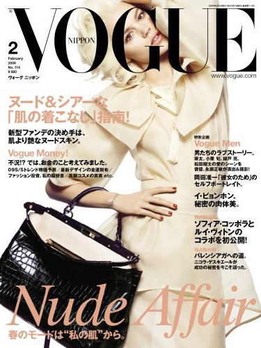
Now you must remember that bad layout case we were discussing not long ago! It was Vogue Nippon’s doing, and we thought, hoped, that it was a mistake.
Well, it’s not! They’re doing it again and I’m afraid it’s kinda like their trademark: putting the letters first, the model after! This time they’ve got Freja Beha Erichsen behind the infamous G. The poor girl looks like she’s stuck in a box, trying her best to put her head and the bag in the same picture… That Desktop Layout Publisher must have been in a life or death dilemma when he/she was facing the inevitable question: cut the head or the bag? The answer – a bit of both and definitely the arm! How’s the new Vogue Nippon February 2009 cover? (photo via tfs)


3 comments
I like how Freja looks and what she is wearing but that font on her face thing they have been doing has got to stop! Someone has got to lay the smack down on these “geniuses”!
I really would like to see what this Japanese Desktop Layout Publisher looks like to understand his or her obsession with Vogue Nippon’s G spot!
Its the second time. I think Daria’s G spot was manhandled last month too.
Oh and the cover’s a tad boring.
I’ve no clue if this is a gimmick like I-d but all 2008 Vogue Nippon covers have this lay-out! In fact the one with Daria W. was not that bad at all. I’ve seen Raquel Z.’s face in a U-turn. Now that was awful so is this one. Its a pity with a model like Freja. She has an interesting face.
Girls, I wonder if magazine buyers in Asia doesn’t want more Asian models on their covers. Lots of Asian magazine have Western models on their covers you see. Every month! While we here wants more variety on covers and photoshoots. Anyone has noticed this?
Leave a Comment