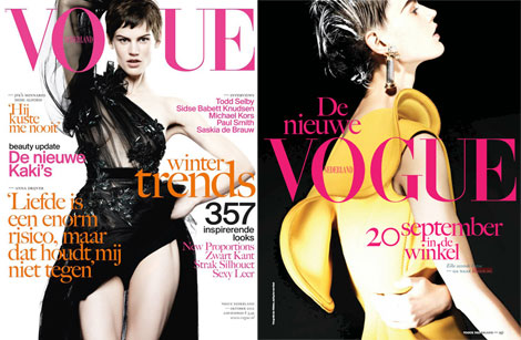
Fashion covers. You can’t tie them to a specific season or see their reality ties. They just are. Fashionable. And stylish. Eye candy. Saskia De Brauw’s Dutch Vogue cover of the October 2012 issue looks like one of those stylish covers I admire but can’t pick a controversy on.
And we like our covers on the controversial side. Don’t we? Badly photoshopped, over cropped, poorly imagined and uninspiredly put together. So yeah, basically what’s left to do here is congratulate the fashion editor who put this together and to Saskia and the photographer who collaborated nicely towards a fashion job well done. There. I said it! (the image on the right is sublime and I hope it’s the subscribers cover as what you’re seeing here is actually the October 2012 preview from the September issue)














1 comment so far
All covers until now are great! They’re doing a wonderful job so far. I also love what they publish inside. Bravo girls!! I have purchased all of the issues. I want to own at least Dutch Vogue’s first year as a whole. :)
The photo on the right is indeed beautiful. I don’t have a subscription so I don’t know if that cover is different? This is the first cover with so many text though. But who cares? It’s still a wonderful fashion cover! <3
Editor in Chief is Karin Swerink.
I am a longtime fan of Fashion Features Director: Fiona Hering.
It's about time to mention some names ;)
Leave a Comment