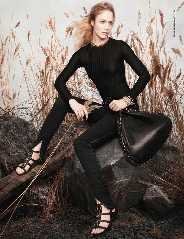
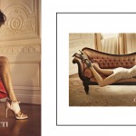
It’s been a while since I last saw Raquel Zimmermann in an ad campaign. And I would’ve actually enjoyed seeing her in Salvatore Ferragamo’s Spring 2013 ad campaign if it wasn’t for the weird styling…
David Sims photographed Raquel in what seems to be a natural wheat backdrop, with her hair blowing in the wind. Speaking of which – how is that hair any stylish? If I would ever go out with my hair like that (well, that was before the ‘big cut’ – now I don’t have that mane anymore – but I cut my hair, 80% of the time it really looked like Raquel’s here), I’d get all kinds of ‘whaaaa?’ reactions.
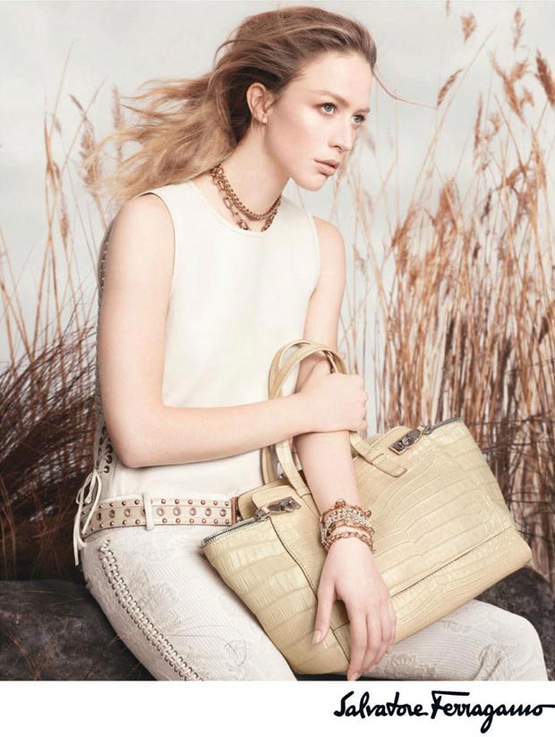
Because, honestly, as much as they want to make it look ‘artsy’ and fancy, that hair just isn’t. It doesn’t even help Raquel who’s looking lost and empty because of that styling. But I guess that’s what you get for mixing luxury & natural. Like mixing water and oil. They just don’t add up.










Leave a Comment