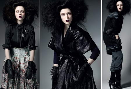
I wonder if Coco is pulling an Agyness on us! She’s everywhere…and everyone loves her! Coco is growing on me too, but these ads are not!
I know she’s pretty, I agree with the overall enthusiastic note but that’s no excuse for transforming her into a plastic scarecrow. What kind of style comes with this pose? The photographed model looks like she’s cramping her stomach out?! (not to mention she’s dressed with special care from her grandpa’s closet) Where’s the smart marketing in these ads? (click picture to see larger image)

(photos via models.com)


3 comments
I like the clothes,and I like Coco Rocha, but the lighting, set up and poses are rather dire and look like goth goes vintage.
Goth is the new hot I believe? I like Coco, I like some off the clohtes especially that left skirt and cropped jacket……but the atmosphere and the poses, no.
On the photo on te right -an apologise on beforehand readers- its like Coco cannot wait for the end of the shoot to rush off to the loo!
I like the clothes from the first two pictures too, Ellington. I don’t feel the third outfit, but that may be mostly because of what Adriana says :) : wear these for a easy digestion!
Leave a Comment