Nina Ricci’s ad prints for Spring Summer 2008 are finally out. Featuring Karlie Kloss and Courtney Smerski wearing some shredded colorful outfits in a splashy background.
Mario Sorrenti was behind the camera which explains the apparent grunge look. I can’t feel too comfortable looking at these pictures, there’s a weird feeling of discomposure coming from.
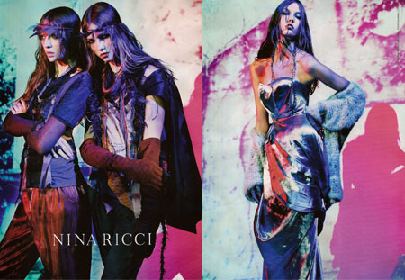
What do you make of this new-age glamour from Nina Ricci‘s campaign? Should I be worried for I have no taste in this damage-goods-trend? Or it’s just going to pass being just a photography license?
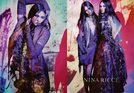
(via tfs)















2 comments
Nope. No. No. Sorrenti is attempting a neew-vox picture thingy. He fails miserably.
Can’t see teh coture for the colour. ***!
You are paid to showcase the frocks, not your bent idea of mish-mash colour.
You’re fired.
‘Cos why? Go look at any – I said any – portfolio of Richard Avedon, and drop to your knees and weep, knowing what a *** you are, with your pretentions.
You are SO horribly bad, so NOT “AVANT GARDE” you should be slapped up the Kodak wall of Death and shot amongst the eyes by a Polaroid.
That`s how awful you are.
E.
Die. Suffering.
True enough, clothes would be the main character in these pictures and yet we can’t see them.
I wouldn’t be so harsh on Sorrenti, he’s got some good pictures too (talking about his work in general). These days I’ll make a new series of posts with some of the world’s most known fashion photographers and their portfolio.
It’s this grunge style I don’t sign in for.
Leave a Comment