When the house of Yves Saint Laurent let go of Stefano Pilati this year (and took Hedi Slimane back), they may or may not have known they’ll be also letting go to “Yves” too. Hedi rebranded YSL Paris into Saint Laurent Paris. Sanctifying fashion, eh, Hedi? (also, Helvetica just became the most fashionable of all fonts. Ever.)
UPDATE: One year later, Slimane is still at the creative helm of the maison founded by Yves Saint Laurent and the fashion world came to terms with the changes he operated. The new direction he’s imprinting on the house’s fashion repertoire is a bizarrely all-too wearable wardrobe at haute prices.
![]()
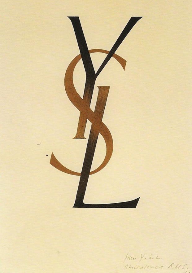
The same can be said about the new fonts he chose for the rebranding/renaming of the maison’s name. Yves himself shortened his name to ‘Saint Laurent’ at his beginnings, to make it easier, more appealing and less pretentious. In 1963 (or in 1961 – according to some sources), an eminent artist and designer designed the typeface and logo for the YSL monogram and Yves Saint Laurent logo.
Slimane kept the monogram but changed the typeface of the label when he shortened the brand’s name in the spring of 2012. However the change became effective in spring 2013 when Hedi’s collections hit the stores. The new fonts, Helvetica, were initially designed by Eduard Hoffmann and Max Miedinger in 1957 under the name Neue Haas Grotesk. It was later renamed into Helvetica and has been slightly reshaped throughout the years and used for street signs, brand names (brands like 3M, Jeep, Motorola, Target), TV shows (Ellen deGeneres). Its versatility has gained the title ‘Bes Font of All Time’ in Germany’s FontShop, the first ever fonts seller in digital history, according to official sources.
![]()


")


Leave a Comment