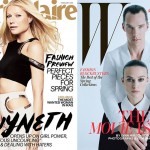
And why shouldn’t I? At least I’m not ashamed to say that out loud in a world where if you don’t “get” fashion, you’re nobody and when you do “get” it, you’re a hipster. I’m not pretending to be a hipster by jumping up and down at the sight of Karlie Kloss doing the almost exact kind of cover as Joan.
Which, you already know, I thought it was brilliant – Joan Smalls on the cover of W Magazine is a bold move for everyone. Now I don’t get the boldness anymore – the creamy tan on Karlie’s face looks so much like Joan’s complexion (which should be natural, biensur – but what’s natural in fashion after all?) I kinda feel like this is one big sad joke. (the story continues right after the jump with more images, click here for the gallery!)
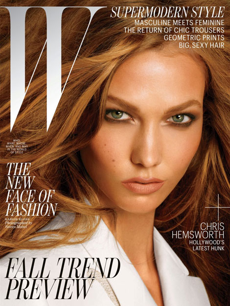
If we only had one cover, everything would’ve been perfect. Coherent, even. It’s like I’m already hearing them saying: “there’s no color in fashion” (makes me laugh just writing it), or “it’s summer, it’s the tan” (puuhlease?), “visually similar thematic for a better coordination and argumentation of the trends” (ummm…nope?).
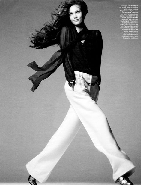
And I may be, again, just blowing things out of proportions, but there’s usually no smoke without fire and there seems to be a lot of smoke coming from tFS.
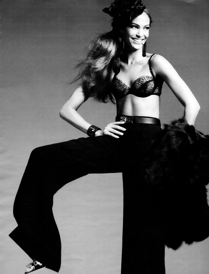
As far as the pictorial goes – it’s going in minimalist direction, with past influences from luminaries such as Avedon. Thank God there’s Karlie to save us all from the dull and the déjà – vu! (I’m sorry, W, Kate Moss’ Good Kate, Bad Kate still remains my favorite! and as for these two covers – my heart was stolen by Joan’s)












4 comments
I am not a great fan of Karlie. I love Joan but I stick to my comment as given earlier at your article about Joan’s cover. Why didn’t you wrote about the ‘twin cover’ in the first place? The thing with Bad Kate, Good Kate is they didn’t force the reader to make a choice. It’s just Kate, good or bad. Why wasn’t just Joan enough? Plus with her on a cover as Vogue Australia proved she has everything working for her to make a real great fashion cover.
Both girls look too much like the regular L’Oréal or Garnier over photoshopped ad-campaigns.
simple – I had no idea there was a twin cover edition! I was so head over heels about Joan’s cover, I didn’t care to do more research ;)!
It’s really strange how they decided to alter the girls’ physical appearance and then label them with “the new face of fashion”. It’s sick.
Oh, you didn’t!! Then I apologise. I only saw the two covers together like everywhere!
Didn’t like Joan’s cover this time. She’s really quite something and they photoshopped her to the max. Why?
So in fact we 100% agree. Indeed it’s sick! I was really angry you see….but I guess you noticed that ;) :)
I guess I only had eyes for Joan ;)
they’re trying to bend the reality into some dumb cliche. As always. Karlie’s pose, for instance, although it stole the heart of every fashionista (and her dog), looks plain odd to me.
Leave a Comment