There’s actually just a handful of things a magazine issue can do to you – besides actually buying it, that is – and one of them is appalling you with a cover only. Today I will get into that. Again.
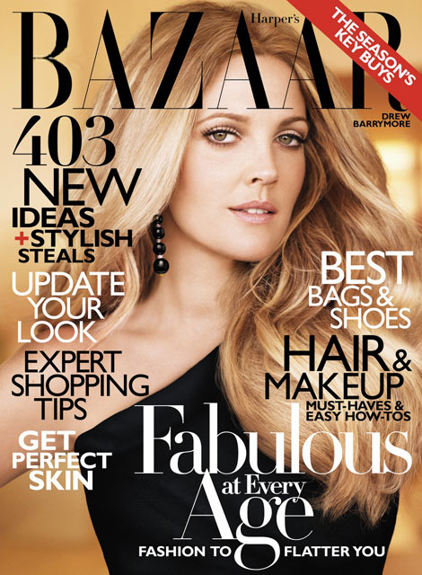
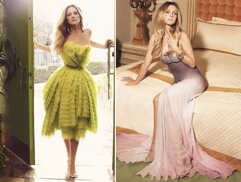
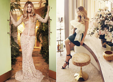
And I’ll start with a mild one: Drew Barrymore on the cover of Harper’s Bazaar October 2010. Lovely lady, lovely looks, horrific photoshop work. We talk so much about this and still nothing changes – we don’t get used to it and those responsible of over – using it don’t get the right measures! We like Drew enough already, there’s no need to give her a statue – like complexion or alienate her physical features just to make a cover smoother and more commercially interesting. More so: why’s Drew looking like Julianne Moore for the people of Harper’s Bazaar completely eludes me. Anyone has any ideas? (HB via)

















2 comments
Gorgeous
I am pea green with envy! Drew has the life!
Leave a Comment