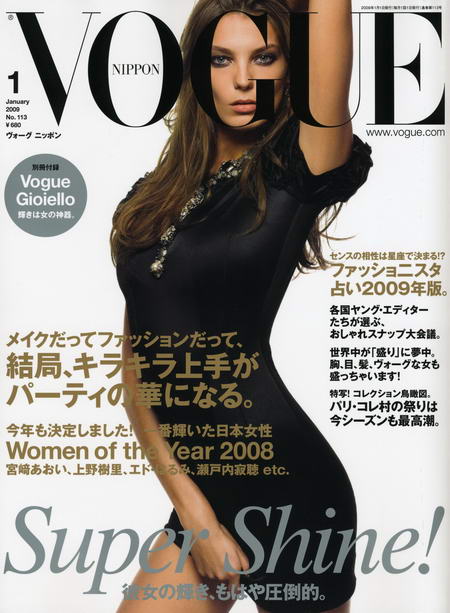
We’ve all seen bad photoshop work. If we’re to believe the upcoming January issue of Vogue Nippon, they’re missing Desktop Publishers. The layout of their new cover is somewhat … unprofessional.
Daria’s face is covered by a big, black G. Literally! I hardly believe they thought we wouldn’t understand it’s Vogue if the G was behind Daria‘s head. Maybe it’s just a case of bad layering from a desktop publisher who’s clearly not a Werbowy fan. Just when I was beginning to like Vogue Nippon, they’re losing that special something. It’s just me, or have you got the same feeling here? (photo via tfs)


8 comments
I have seen magazine covers where they have removed one of the letters in their title font but this is odd. I like Daria’s “S” pose but the big G covering her face is a tad distracting.
You know what, I wouldn’t have even noticed the G spot (LOL!) if it wasn’t mentioned here.
Maybe Vogue Nippon should have tried a little humour and put that G around Daria’s neck.
I wonder if the Japanese should try to loosen up a bit as fashion seems like a religion to them.
I can’t get over the ‘G’ over her face! You’re right, it does look messy!
I am also disturbed by her right arm. It has been stretched out, rubber-like, elbow flattened. Bizarre.
^ yeah, you are right.
BlissBoo, now that you mentioned it, indeed the right arm looks very rubber-ish and unnatural! I was so caught up in the G thing, I didn’t even look further for more flaws.
Dolly Bird she seems to be saying something with that G on her face and her hand lowered like that…
BlissBoo and kpriss OMG I just noticed the elbowless right arm too!
Its so obvious they wanted it in symetry with Daria’s backline. How eerie!
Kpriss I think you would have done a better photoshopping job! Not that I think Daria needs it.
This one is not that bad as the December issue of Vogue Nippon with Raquel Zimmerman’s face in a strange “U-turn”. In comparison to that one this one with Daria looks -besides the odd arm- errrrmmm, “charming Japanese”…….
Leave a Comment