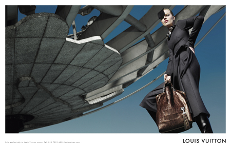
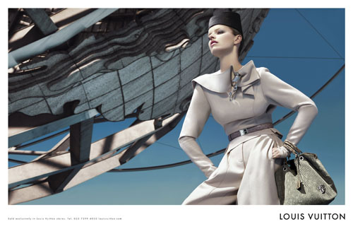
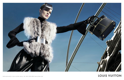
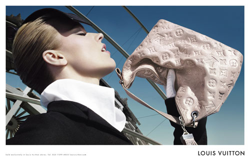
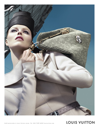
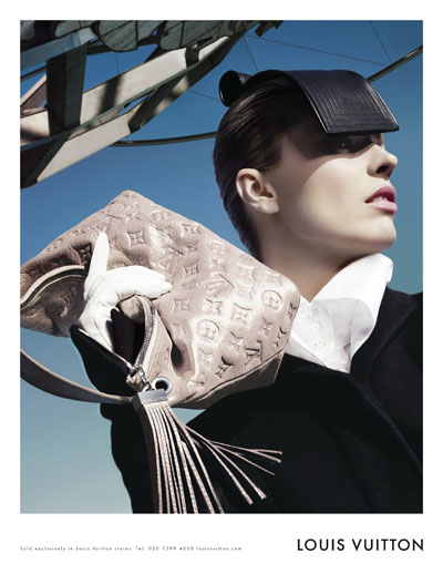
If I wouldn’t entitle the article like that, I wouldn’t be talking about the current Louis Vuitton Fall Advertising Campaign. Sterile. Like a circle with abrupt edges. Absurd!
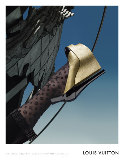
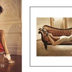
It’s like Gucci Spring Summer 08 meet Sky Captain and the World of Tomorrow everything multi-tagged with the beloved LV monogram. The only good thing here is Eva and her symbiosis with the surroundings, the outfits and the accessories. Perfectly flat. Oh, and one more point I’d like to pin for you: those beyond outrageous shoes! What’s fashionable about them? (click the thumbnails to see larger images)











5 comments
Thanks for your comment. I really enjoy your blog, like i enjoy the Louis Vuitton campaign !
You do, really? (the LV campaign, I mean ;) ) it seems so cold to me!
I LOVE your posts, on the Louis Vuitton! I put links on my blog to your articles for my blog on campaign ads for LV F/W 08.
I actually really like this ad campaign. When I think of LV, I think of jet-setting off to an exotic island, in my private jet (I wish!!!), taking my LV travel bags with me. I could imagine a lady dressed like this, waving goodbye, from her private jet- looking glamorous and dressed to kill!
Yes, I do agree that the background object is a little bizarre, but somehow it fits with that aviation theme.
N, thanks, you’re welcome anytime!
Penelope, you’re such a romantic! :) In fact, the bizarre background object is the Flushing Meadows Globe and it fits some luxurious globetrotter theme indeed. Marc is thinking big. Marc is thinking globe-scale. Who are we to argue his luxury vision?
Leave a Comment