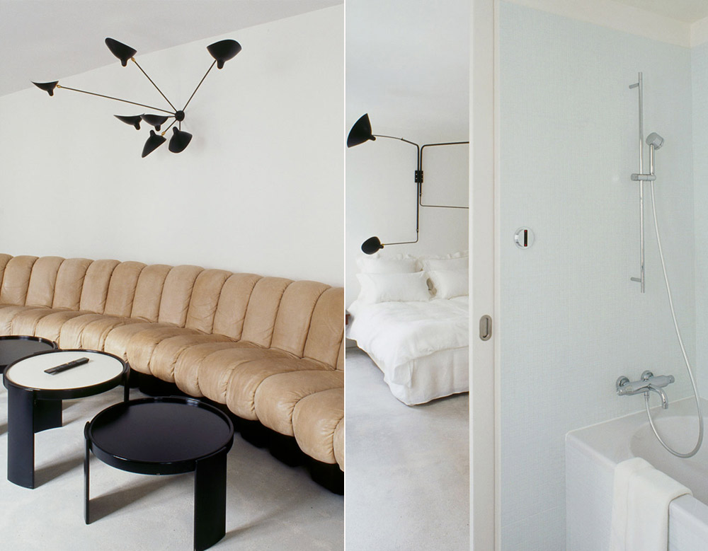
There’s this little hotel in Paris called Hotel 3 Rooms located in the 4th Arrondissement, 5 Rue de Moussy to be more specific which wouldn’t have made its way here without some significant fashion revamping. The reputed designer Azzedine Alaia is responsible for the concept and the decoration of the three suites (a total of 300sqm) – even the food is prepared and served from his private kitchen, located an arm stretch away from the said hotel.
Aside from it being designed by Azzedine Alaia, I can’t put my finger on something really impressive when looking at these interiors. Sure, the couch has the wow – factor to the max, the furniture is under the minimal sign, young designers and vintage go together hand in hand. But… where’s the coziness of it all? Do fashion people live in such soul-less, desert environments? (be sure to check the rest of the images after the jump for a better understanding of Azzedine Alaia’s interior decoration attitude)
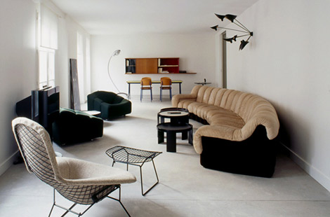

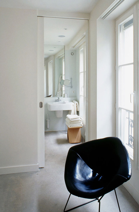
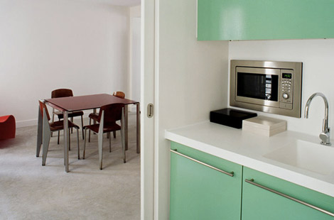
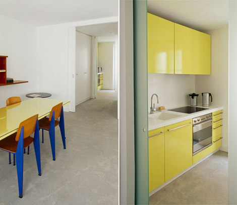















2 comments
Its cold to me.
No ornaments whatsoever to give it some character. Not even a lamp. Was he afraid people would steal them? Minimalism doesn’t always have to channel a hospital waiting room.
I’d feel the need to wear shades in that place with all that clinical whiteness. But then its a place to sleep in as most customers would roam Paris during the day so hail the minimalism for the delighted cleaning lady. I heard the prices are attractive though.
The bed looks nice and comfy but I am not really a fan of how the room is styled.
I agree with DollyBird, it does look rather cold, with a touch of affected minimalism. It seems like it is trying too hard not to look like it is not trying too hard.
Leave a Comment