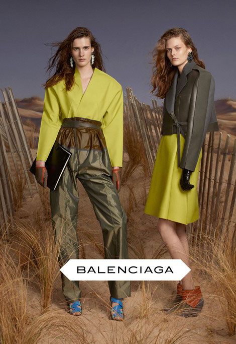
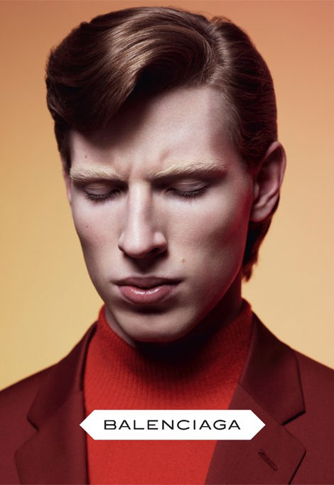
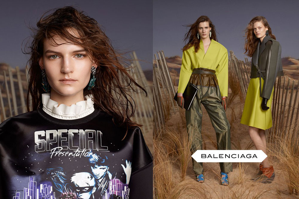
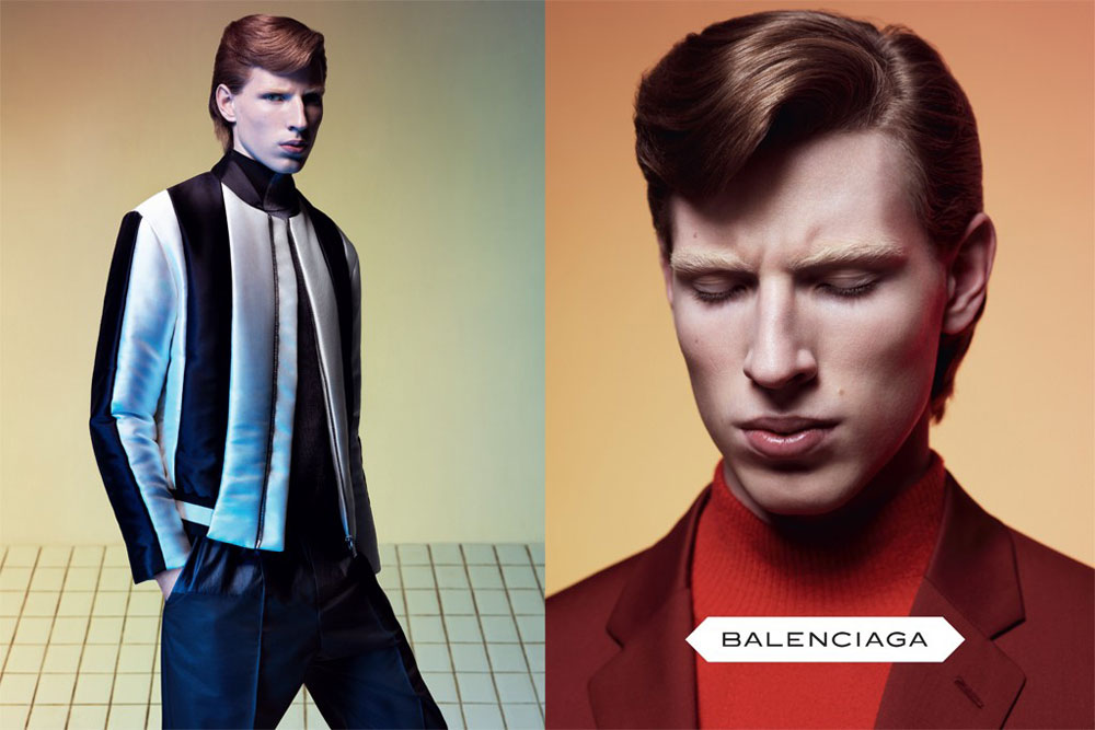
After seeing the wonderful Kristen Stewart doing an amazing job for Balenciaga’s Florabotanica ad campaign, I was really curious to see what unearthly aesthetic, second – hand clothes and childish photoshop brings Balenciaga’s Fall Winter 2012 2013 ad campaign for both women and menswear!
And my curiosity was fully satisfied with a preview of the said campaign as provided through wwd. Steven Meisel photographed both campaigns and the styling is… well.. Better than Florabotanica, that’s for sure! I’d like, however, an honest opinion from someone who finds Balenciaga’s aesthetic really appealing. Someone who will apply a positive filter to all this (mess). Is there anyone who’d like to share visions with us? Enlighten us?


















Leave a Comment