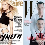
I couldn’t just let it pass since it was already controversial. The W September Issue with Kate Hudson on the cover got me thinking if it was just a cover-remake or more.
Looking at the pictures I must say it was just the cover. Even if they’re both blonds and beautiful, Kate’s and Nadja’s photo shootings were rather different. “Le freak c’est chic” from the September 1994 Harper’s Bazaar is strongly masculine and aerial, the W Hudson looks more like PVC Maid meet coroner cuisine. (more images after the jump)
I can’t help but think about the Iron Man madness and take this Mert and Marcus photoshoot at another copy-level. If the cover remakes Patrick Demarchelier’s Bazaar, the photos inside follow the Wintour Iron Man guideline.
You can also admire Nadja’s spread from 1994 and have your saying – similar to the Bazaar or faithful to the Iron Man thing?
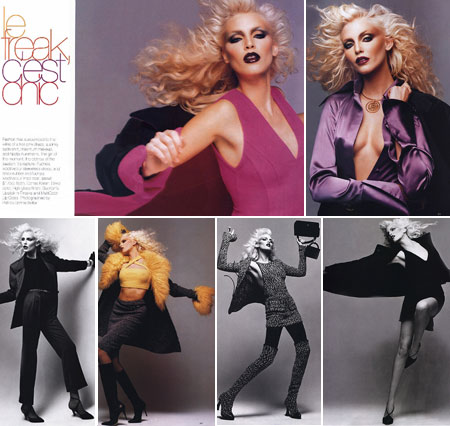
(photos via dailymail, tfs)



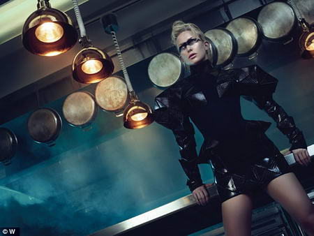
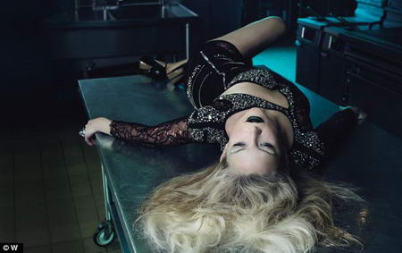















3 comments
I don’t really get the Kate Hudson photo spread.She looks like a fetischist waitress waiting for the chef cook after the restaurant closed.Nadia’s spread wins hands down.I get the Studio 54 theme.Those endless legs of hers are legendary.
Lets see…
Kate’s shoot= Creepy Hell’s Kitchen!
Nadja’s shoot= Glam and styling!
Nadja wins!
Absolutely endless legs! I still liked her better when she had short hair. She looked untouchable.
Leave a Comment