I always loved Missoni. I don’t know why, no matter the trend, Missoni has a strange way of hanging in there. Very IN.
It looks cozy, reminding me of some traditional knitting piece, bringing back some of the tenderness of simple times when knitting was something you did instead of watching The Hills. That’s why I wanted to show you this Corian Loves Missoni from the Corian Design’s Milan Showroom. Because no matter the materials, no matter the shapes, the Missoni prints always warm things up.
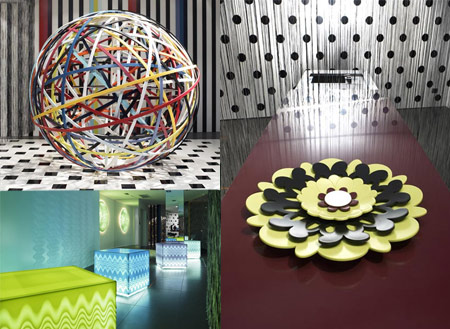
Different pieces of furniture, some illuminated from within using the DuPont™ Corian® solid characteristic with Missoni Color enhancement for the best expressive result possible. The project, directed by Rosita Missoni and supervised by her son Luca Missoni is a loft apartment on two levels taking full color advantage from this wonderful promising new-usage-found-material that corian seems to be when talking its use as see-through illuminated from inside products (thank you, trendoffice).
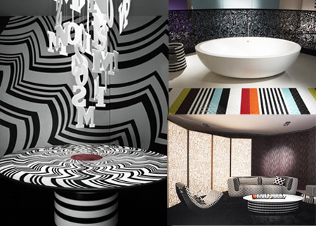
However, as lovely as the Missoni prints are, I still think that, for a home, strips and stripes overload is health damaging. Would you Missoni your home?
(via dezeen)









4 comments
Yes, you are right – Missoni prints are great as an accent, but should be used carefully. But corian is not a new material. New is its use as see-through illuminated from inside products.
Riiiight! Thanks for bringing the facts to light! (I’ll go mention it in the actual post so accuracy can be restored). You know what I loved the most (talking Missoni accents) – in the second picture, top right, the bathroom – the flooring! I really think those stripes there were the missing link in bathroom evolution!
[…] more like Museum Missoni, not Hotel Missoni! (rezidorparkinn via vogue, photos missonihome) If you like this post then please consider […]
Missoni is the best Corian designer,her designs are so cool.
Leave a Comment