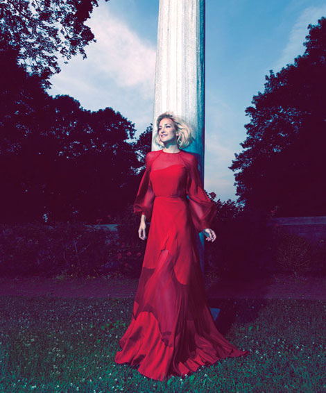
Oh, this is so bad! Kate Hudson on the cover of Harper’s Bazaar October 2012 as photographed by Camilla Akrans looks awful. Not her. Not right. Just wrong.
I wonder how this works. One witty fashion editor wakes up in the morning with the most amazing idea: let’s take someone famous, good looking, funny and so forth and make this pictorial where she / he don’t look like herself / himself anymore! But like an overused Marilyn – esque cliché.
And you know what? to make it more “aujourd’hui”, we’ll use these Instagram – like filters! Why not? people like Instagram!
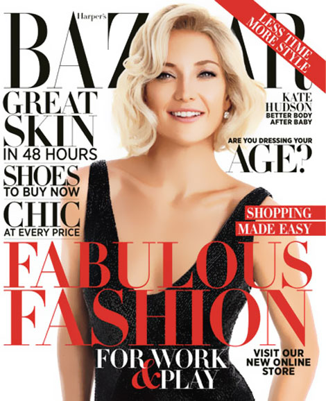
I do too! I love Instagram! I even love Kate Hudson! So if someone could take this clone and bring back funny Kate? Thank you! (oh, and there’s also an interview with Kate talking about her personal life et caetera, here)











1 comment so far
This is awful. Kate looks way and way better photographed casually with Matt while pushing her baby stroller!! Or next to Matt while he’s doing the job ;)
Leave a Comment