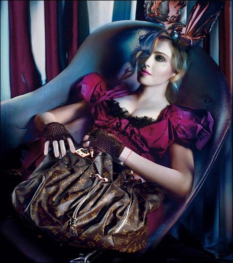
Now this is what happens when overdosing with Photoshop. Bunny eared Madonna (I guess the Met was a spoiler) looks completely plastic made in her aerial, ethereal, immaterial pose by Steven Meisel ft countless digital enhancements.
Not to argue with gravitation and so many other basic physics principles, but shouldn’t this campaign be about Louis Vuitton? Her Madjesty clearly steals the picture and the idea. This is the first (unofficially leaked) image from seven pictures-set that are said to be (officially) released in August (more boots and bunny ears to follow in Madonna’s fight against gravitation and time). Was this what you expected from Louis Vuitton fall-winter 2009 ad campaign? (via)










8 comments
Not the world’s biggest fan of this, but using Madonna is guaranteed to generate LOADS of attention and coverage (as it did before) so I’m not surprised LV and MJ have got her onboard for another season, especially in these tough times for luxury brands.. I just find it all too obvious and commercial and a bit artless.
I don’t really have any expectations about this. I just take what they give me visual wise and then I decide if I like it or want it.
Actually to tell you the truth it does not even look like Madonna.
It looks like a mannequin with the face of 20 year-old Madonna. Oh, it’s like those Agyness mannequin.
Apparantly this cooperation is a success so why not continue it? It does give me an impression what kind of people are impressed with this.
Madonna has never look like that.
‘It’ doesn’t look like Madonna. ‘It’ is photoshopped to the max. Even her hands. Madonna has very ugly scary hands. So probably there’s no nip/tuck solution for this until now. She always had kinda rough man-ish hands. Due to all that weight lifting it has gone worse???
The big ads in louisvuitton bags. This is the first (unofficially leaked) image from seven pictures-set that are said to be (officially) released in August
Exactly. If they hire Madonna why don’t they let her look like herself? If they want a young looking ‘airbrush-tastic’ they should hire a younger model. No one is impressed when the photoshopping consumes the whole photograph. Ditto Nicole Kidman and Renee Zellweger – they look so bizarre on magazine covers – their mature, sophisticated faces erased of all lines and wrinkles. I have one word for you:
A L I E N
Leave a Comment