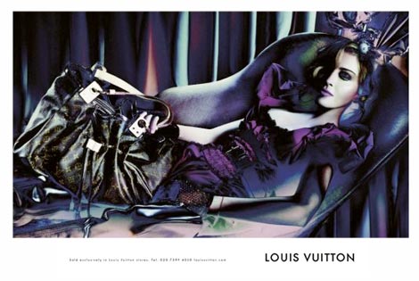
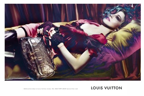
Even if there was no official confirmation from the house of Vuitton that the first leaked picture is really part of the Louis Vuitton Fall/Winter 2009/2010 Ad Campaign, the rest of the pictures are now available and making the rounds of the Internet.
Madonna looking younger and more plasticized than ever with a Photoshop overload that could make any decent desktop publisher blush with shame at the thought of submitting such an image to the public eye. (the story continues with more images right after the jump!)
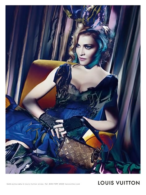
Every time I look at these images, the vintage theme of an old photo studio and a bad photo rendering comes to mind. Normally, this artsy effect would have been called burned film and rejected due to the low quality of the portrait. Is there a 3D trick behind this campaign? Something that would make her Madgesty bigger than life if wearing the appropriate lenses?
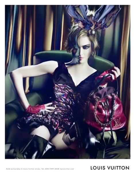
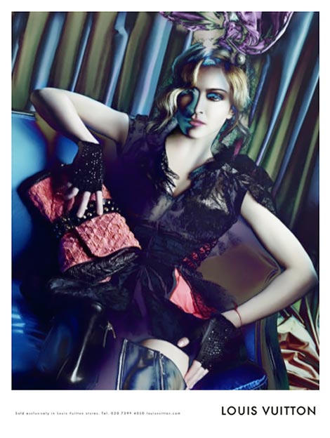
Photoshop to the extremes, it’s totally Madonna – pushing the boundaries in everything she touches. Everybody does a bit of Photoshop, but not her Madgesty, no-oh! She does loads and loads of Photoshop till you’d say she’s looking more like Emma Watson (lol) than her iconic self. What I wanted you to debate is whether there’s a moral justice in only calling Madonna’s name in this Ad Campaign: the true star of the Louis Vuitton Fall/Winter 2009/2010 ad campaign is the photographer/photoshop artist who was behind the after shooting image filtering! (is Steven Meisel the true responsible of this extreme photoshopping?) (photos via)













5 comments
I love the colours of the ads but that most certainly does not look like Madonna. She has been airbrushed out of existence in these photos! Not to be believed!
This is a fantastic ad campaign. The saturation of photoshop, the stiff doll-like poses of every picture, the blending of her, the furnishings and the backdrop accentuates the bags. Beautiful color rendering and quite unique. Everything you see is deliberate and produces vivid contrasts from the bags themselves which is the true product. These are far more exciting than the previous campaign used with Madonna. Although beautiful photos done in a cafe setting, they were more true to life in a real environment and the bags became camouflaged.
In this case, the series of photos are bold yet decadent and very fresh. Well done Steven!
This a photographic technique called solarisation with the help of which an image is partially reversed in tone. It was made famous by Man Ray in the early 20th century. Thusly, before embarrassing yourself with sad Photoshop remarks, it would do you well to learn your art history first .
I could reach eternity in trying to erase the wrinkles of a 50-years old (normal) person only by solarizing a negative (or, by using some of the handy Photoshop/Corel tools). Her flawless skin, her baby-doll appearance may fit into the photo shoot scenario, but that doesn’t make it less digitally enhanced, does it?
As for the photographic technique, thank you, Dash for the useful information! I was so curious that I tried my amateur hand in digitally solarizing a picture right after reading your comment! Nothing compares to the real negative solarization, as I understood from reading around, but thanks to you, I just learned something new! (and that’s priceless)
I love the idea of using the solarization but it’s just not selling LV to me, or I am done with LV.
Leave a Comment